Having stations on the map seems obvious; stations are important both for someone travelling by public transit and as landmarks for anyone driving. Many are prominent, ornate buildings occupying a large footprint in the urban landscape, but others can be small, spread-out, tucked into a corner or buried underground. When looking at an overview of a city, it may not be possible or desirable to show all the stations, and it can be hard to tell: Which stations are important? It seems like it would be useful to be able to compare stations and rank them by some measure of “importance”.
What’s a useful metric for importance of stations? The reason we want to show them on the map is that the more important stations are more likely to be known by a larger number of people, due to having travelled via them. The ideal metric would, therefore, be the number of passengers who transit via the station in a given period of time.
Unfortunately, the availability of passenger number data is patchy, and collecting it globally would be a lot of work. Thankfully, there are people taking on the difficult task of collecting open data about transit and places, generally. At the moment, neither of these contain passenger numbers for every station in the world, so it looks like we’ll need something else to fall back on.
If we have access to the structure of the transit network, but nothing else, can we deduce anything useful from that? It turns out that this is called Network Theory. One example of network theory is Google’s PageRank algorithm, which can be used to generate better search results by looking at the number of web sites which link to a given page; pages with more inbound links are likely to be better results. By analogy, the more important stations will be the ones bringing more passengers in by being on more train or subway routes. Additionally, stations part of a large number of different routes are more likely to be places where people change between routes, and therefore more likely to be well-known.
Some places in the world have many train stations, and in others trains are relatively rare. Also, some places in the world have more of this data mapped. This means that whatever metric we can derive from the structure of the transit network is likely to be valid only for comparing between stations within roughly the same area. Trying to compare globally is likely to run into these issues, but if we’re only looking to use this metric to rank stations which will be visible on the map at the same time, then we should be okay.
In summary, we might be able to approximate the relative importance of nearby stations by counting the number of different routes that they’re associated with.
It’s worth noting that route can have different meanings in different contexts, and is especially overloaded when it comes to public transit. In this post, I’ll be trying to use route to mean a named line (physical track) or regular service. This runs against some good advice to use line for things where the service runs “so often that you don’t need a schedule”. Using route for this, although undesirable from that point of view, fits better with the source data, which will be explained in the next section.
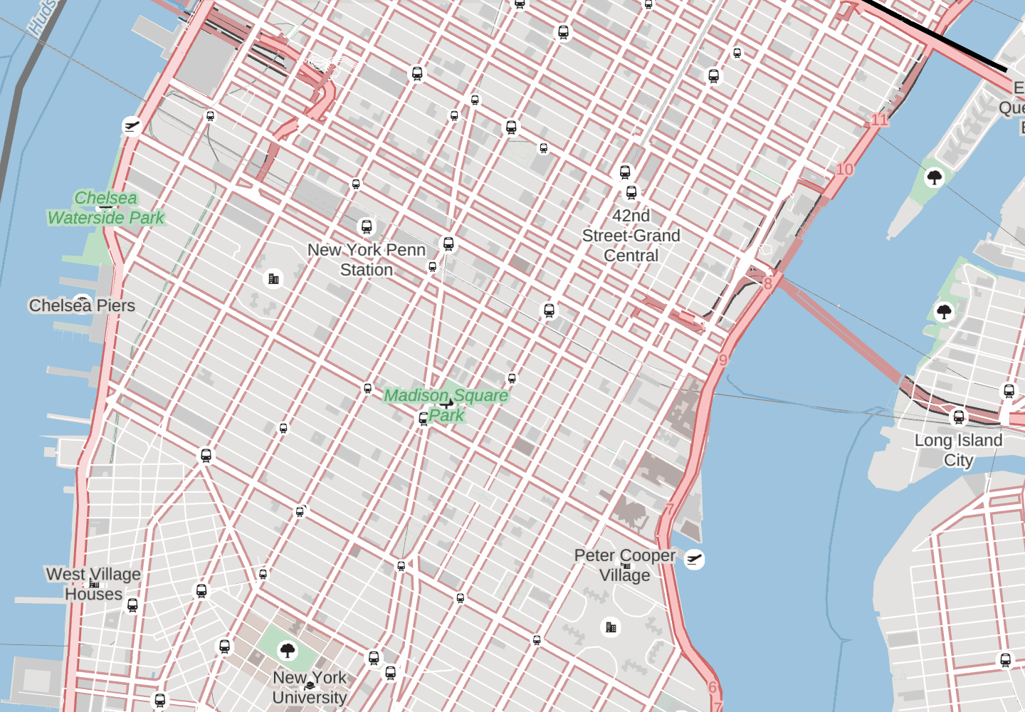
To see what a difference it can make to show only the more important stations, have a look at this animation showing the stations with fewer routes fading in and out. Penn Station, Times Square, Grand Central and Long Island City all remain, as the stations serving the largest number of routes. On this map, which doesn’t have many other labels, it might seem like having more is better, but notice how the stations crowd out other features such as New York University and Madison Square Park - in this case, fewer is better.
Diving into the data
If we want open data about transit networks for the whole world, there’s really only one place to get it: OpenStreetMap (OSM), the “wiki world map” is maintained by thousands of volunteers world-wide who put a huge amount of effort into mapping things, including transit networks. However, stations in OSM are often just points (called “nodes” in OSM jargon) with little extra information included as part of the object.
OSM doesn’t, and nor should it, contain ephemeral and non-verifiable data such as schedules. This doesn’t mean that schedules aren’t important - they are! For schedule data, we would have to rely on openly published “feed” information, which can be found at Transitland. For accurate trip planning it is necessary to know both the schedule data and the geographic data, which makes the answers time-dependent. This is exactly what makes a trip planner useful! However, the metric of “importance” for a given station probably shouldn’t be time-dependent for a general-purpose map (it sounds like an intriguing idea for a transit-specific map, though - take a look at this service frequency-dependent map!), so we can use the geographic data in the OSM data.
OSM’s data model is more sophisticated than nodes alone, and also includes “ways” which join up nodes to form lines or polygons, and “relations” which describe relationships between nodes, ways and other relations.
Relations are powerful, and sometimes confusing, objects. They exist to provide a flexible way to introduce structure to the OSM data without having to impose a rigid, limited set of permitted structures from outside (called an “ontology”).
Let’s take a look at an example of a station node - U Bundestag in Berlin, Germany. We can see that it is part of a route relation which tells us that the U-bahn line U55 goes through U Bundestag.

This is great! But sadly not all stations are directly members of route relations, and many stations are composed of different collections of platforms or different kinds of lines. It is necessary to dig a bit deeper to get all the information.
It’s worth noting that this “route” relation is, in all likelihood, a line in the sense of good transit terminology. In OSM, the relations representing either named physical lines or named regular services are called “routes”, and since this article is mainly about navigating the data in OSM, using the not-so-good transit terminology would seem best for clarity.
Let’s take a look at a more complex example of a station node, Châtelet on the Paris Métro, France.

We can see that the station node is included in a relation which has data saying it is a stop area. Stop area relations link several stops together, and indicate that they’re grouped as a single unit intended for changing between lines or modes of transit. Stop area relations generally contain several nodes with a data identifying them as stops or stations in their own right.
Stations and stops are often directly included as members of route relations, as in the case of Châtelet, but sometimes are not. When they’re not, we can look to see if the node is used as part of a way describing the geometry of the railway track which, itself, might be included as a member of some route relations. Let’s take a look at Euston station as an example.

The Euston station node is part of two stop area relations, one of which is the underground part of the station. This stop relation contains a node for the stop position on the railway line for the Northern line route relation. Whew! That was a lot of indirection to go through!
We’ve now seen several different ways of navigating the OSM data structures to get from the original station node to many route relations, each of which is potentially a different route that a passenger could travel on. Taking all of these routes, we can estimate how much of a “hub” this particular station is, and use that as a proxy for how visually important it should be.
Extra information
Much of this is described for many different forms of public transit on the OSM wiki. However, when using data from OSM it’s important to use real examples and test things on real data from the OSM data dumps or metro area extracts. What really matters is that the code works, and calculates the data you’re interested in. Documentation on the wiki can be helpful, but is often out of date with respect to the data - and sometimes reflects an ideal of what the data could be, rather than what it is. If there’s ever a conflict between what the wiki says and what real data exists, then the real data is right!
Implementing it
We’ve implemented this on top of a rendering database created with osm2pgsql as part of our vector-datasource tile rendering. Before we jump into the code, which is far from straightforward, it’s worth going through how osm2pgsql stores information about relations in the database.
The output tables which osm2pgsql creates by default contain points, lines and polygons processed from OSM data, but no information about relationships between OSM objects. To get to that information, we have to look beyond the output tables and into the guts of osm2pgsql; the “middle” tables.
The middle tables exist because osm2pgsql is able to process updates from OSM and needs to keep track of the current state of all items to know what has been updated and fetch dependencies of objects. We can make use of the middle tables to fetch information about relations.
Relations are stored in the middle tables in the following schema:
CREATE TABLE planet_osm_rels (
  id bigint NOT NULL,
  way_off smallint,
  rel_off smallint,
  parts bigint[],
  members text[],
  tags text[]
);
Each row in planet_osm_rels stores a single relation, identified by ID id. The parts are the IDs of all of the members of the relation, stored in an array with the nodes first, then the ways, then the relations. The index of the first way is given by way_off, and the first relation by rel_off. This is a compact method of storing the IDs, but leads to a problem when we want to join this table to something else: GIN indexes can only help us identify rows with a particular ID anywhere in the array, not within specific sections. So we have to do a secondary filter to ensure we don’t pick up anything other than the relationships we are looking for. For example, when we are looking for relations which contain a node with ID station_node_id, we need a filter like this:
r.parts && ARRAY[station_node_id]
AND r.parts[1:r.way_off] && ARRAY[station_node_id]
The first part allows PostgreSQL to use the GIN index. The second line ensures that we only pick up relations containing that node, not any relations which might contain a way with the same ID.
We also only want to search for specific types of nodes, ways and relations at various points in the algorithm, so we filter on their tags, which are key-value pairs of strings. For relations in the planet_osm_rels table, these are encoded as a flat list, for example: [key1, value1, key2, value2], and so we have a function mz_rel_get_tag to decode that list and fetch the value for a given key.
The algorithm proceeds with four main steps:
- We find stop area relations containing the original station node (or way).
- We find any station or stop nodes contained in these stop area relations.
- We find any railway lines which make use of any of the station or stop nodes.
- We find any route relations which contain any of the station or stop nodes or any of the railway lines.
The full code for this function can be found in our vector-datasource repository on Github.
Stop Area Groups
One thing that hasn’t been mentioned yet is another layer of indirection: stop area groups. These are infrequently used to group together multiple stop areas. Adding another layer of indirection would be easy, but might require us to think slightly differently about how to aggregate multiple stations which might be part of the same stop area group.
Grouping and aggregating stations at lower detail levels would be very nice, and immediately seems desirable, but can lead to unexpected visual artefacts: When a station dis-aggregates into multiple parts, what had been a very important station-group might fracture into many individual stations, each of which is not important enough to display. It would appear as if the station simply disappeared, which isn’t good.
The Shortcut
If that all sounds great, but a little bit complicated, then you might be interested in our vector tile service and our fully-featured tile styles such as Cinnabar. These already have the logic above baked-in and ready to use! Just look for the kind_tile_rank attribute on kind: station features. This starts at 1 for the most important and increases as the features of that kind get less important in a given tile. In conjunction with Tangram’s powerful and flexible styling rules, this gives you fine control over how best to display your map to your users.
Ready to get started? Sign up for an API key today!
Mapping this data
If your important local stations aren’t being displayed at mid ranges on Mapzen maps, it might be because we aren’t able to find the links between the station node or way and the route relations. You can create relations for each route, where a route is usually a named line such as “Northeast Corridor” or a named service such as “California Zephyr”. You can either include the stations directly as part of the route relation, or create a stop area relation containing the station node or way and any stop nodes which are part of the route.
By adding stop area and route data, it not only helps us figure out which stations might be more important for display on the map, but also helps anyone else who’s looking to build trip-planning or transit-related applications on top of OpenStreetMap. Thank you in advance!
