Transit colours help distinguish lines!
Welcome to our Targeted Editing series where today you can hop on your favorite transit line, or make OpenStreetMap data divine! (Both take about the same amount of time.)
Read on for some basic uses for transit line colours, why I am using the British spelling, and where you can check to see if you can use your local knowledge to add colours where they are needed.
How can transit line colours be used?
Help with map rendering. Transit line colours can be used to make custom maps designed specifically for transit users.
Help with wayfinding. A line colour on a map can help a traveler quickly understand generally where a route goes, without needing prior spatial knowledge of the origin or destination stops.
Are there transit features in OpenStreetMap? Yes!
But how do we quantify them? Let me count the ways… 💗 actually, no, let’s not do that. That would only tell us how many individual segments we have, which is a bit abstract. It effectively translates to the number of segments editors have digitized. Not trip segments, mind you, just individual ways with unique ids. Instead, let’s look at kilometers.
Kilometers of Transit Lines
| Railway Relations | Railway Ways | Route Relations | Route Ways | |
|---|---|---|---|---|
| Beijing | 4,835 | 11,655 | ||
| Berlin | 10,385 | 45,289 | ||
| Boston | 663 | 994 | ||
| DC | 25 | 3,763 | 16,018 | |
| London | 106 | 12,738 | 50,489 | 2 |
| Moscow | 11,070 | 69,602 | ||
| New York | 6,025 | 21,745 | ||
| Paris | 3 | 9,013 | 44,841 | 0.10 |
| San Francisco | 21 | 1,381 | 6,372 | |
| São Paulo | 1,909 | 8,642 | ||
| Sydney | 1,576 | 6,116 | 0.58 | |
| Tokyo | 69 | 11,893 | 37,831 | 0.14 |
What’s happening here?
Transit features are relatively well represented in our sample of cities. The railway key is more often associated with ways, whereas the route key is more often associated with relations.
What does it mean for one city to have more kilometers than another city? Diversity of added transit lines could be one factor. Separate lines for inbound and outbound routes can be another. Yet a third factor could be the detail of editing because a very straight line between point A and point B will be shorter than a curvy line between the same point A and point B. Last but not least, these cities are different in size with varying public transportation networks. Given the area of each of these cities (as determined by the Mapzen metro extract, not reality) these numbers are all impressive.
What does it mean when the length of relations far exceeds the length of ways? The most dominant explanation goes to Osm2pgsql and the consistency of tags editors apply. The data for this post was imported into a PostgreSQL database using Osm2pgsql. When a relation and it’s members have the same tags, Osm2pgsql drops the members during the import process.
The table above is a result of looking at the collective distance across many transit types (buses, funiculars, light rails, monorails, rails, railways, subways, trains, trams, and trolleybuses).
Breaking this down further, at least some colour is applied in every city, and you are more likely to find it applied to route relations. This makes sense because when a relation is present, it is much easier to add additional tags to it. Tags on a relation apply to all the ways that are members of the relation. With this in mind let’s review route relations, and the transit types that are more likely to be referred to with colours. Think of things like “The Red Line” in Chicago.
Percent of Route Relations with Colour
| Light Rail | Subway | Train | Tram | |
|---|---|---|---|---|
| Beijing | 72% | |||
| Berlin | 100% | 100% | 61% | 81% |
| Boston | 100% | 81% | 13% | |
| DC | 88% | 83% | ||
| London | 100% | 51% | 100% | |
| Moscow | 2% | |||
| New York | 72% | 98% | 94% | |
| Paris | 100% | 96% | 94% | 96% |
| San Francisco | 8% | 100% | 57% | 19% |
| São Paulo | 100% | 100% | ||
| Sydney | 100% | 48% | ||
| Tokyo | 19% | 92% | 12% |
What’s happening here?
Spatial variability, that’s what!
Figuring this out is like a scavenger hunt… only indoors… with a database. Ok, so not like a scavenger hunt, but definitely exploratory data analysis. Are we missing some things? Probably. The queries are specifically looking for relations with the route key. In Moscow, some of the colour is only applied to the route_master which works well when relations representing the inbound and outbound routes are members.
It is easy to focus on relations that are tagged route=light_rail, route=subway, route=train, or route=tram, but each city can be different. For example, Tokyo also has 133 kilometers of relations that are tagged railway=subway and half of them have a populated colour tag. As you can see from the table above, Tokyo also has relations that are tagged route=subway. In other cases, a relation doesn’t exist at all, but an editor has taken the time to add colour to the individual ways.
Helpful Tags
- name=*
- ref=*
- colour=*
- Tips (because consistency is key)
- Use an RGB colour code (hex triplet) preceded by a hash or pound symbol with lower case letters where present.
- YES: #ff0000
- NO: FF0000
- Alternatively, use a CSS color name in all lower case letters. No spaces, no underscores.
- YES: mediumblue
- NO: medium blue
- NO: Medium_Blue
Again, the best place to add the colour tag is to the route relation. Be sure to add it to inbound and outbound route relations where present. If a route_master is present, add the colour tag to it, too. A route_master is used to group relations. An example in transit would be a route_master that groups the inbound and outbound route relations. If no relation is present, this is your opportunity to add one. Adding the colour tag to the individual ways should be a last resort.
How do you find the route relation? Using iD, you can always click any way, and if it is a member of a relation, you will find a link to the relation listed below the tags when you are in edit mode. Check the left side of the screen, and scroll all the way down to the bottom. Sometimes you will find multiple relations.
For details on relations in general and the specifics of route and route_master relations, explore these wiki links:
A promise to explain why I am using the British spelling for the word “colour” begins now:
In the simplest terms, the British spelling is the preferred spelling for keys and values (tags, collectively) in OpenStreetMap. Nearly all* of the data explored for this post had the British spelling when colour was present and evaluated. Other British spellings to watch out for in OpenStreetMap include centre, jewellery, kerb, and neighbourhood.
*See the queries for additional tags that have been used to represent colour.
Where to Start
The best place to start is always where you have local knowledge. If you are familiar with a set of transit routes that are commonly referred to by colour and it would make sense to symbolize the routes with these well known colours, please review them in OpenStreetMap to ensure that they have been tagged properly.
It never hurts to augment your local knowledge with a bit of research for verification. Make notes when you are taking public transportation, and seek out authoritative sources. Mapzen’s Transitland Feed Registry is another excellent resource.
The Feed Registry contains a steadily growing collection of GTFS data, and some of the feeds include route colour! At the time of this writing, our Feed Registry had 159 GTFS feeds for metro lines with populated route colour data, and this is just a subset of the total number of feeds available. In total, you will find 49 unique colours just for metro lines, and all of them comes from transit agencies, civic groups, universities, and community contributors. You could not ask for a more authoritative source!
Metro Line Route Colours
from Transitland’s Feed Registry
Special thanks to Transitland engineers Alex & Ian for querying the Transitland Feed Registry API and sorting the colors for this post! If you are interested in the magic of this sorting, check out Ian’s transitland_route_colors gist. We all had a lot of fun querying the Transitland API. Go ahead, give it a try! Here’s a sample URL to get you started (click to download the 4.6MB JSON file):
http://transit.land/api/v1/routes.json?vehicle_type=metro&per_page=1000If “query the API” sounds like Greek to you, the user interface can be used to visualize data from the Transitland Feed Registry. When you land on the Transitland Feed Registry page, follow the link in the Operator Name column to the agency you are interested in, click the “view” link for the routes if there is one, and wait a few moments for the data to render in the geojson.io viewer. Choose the table view and look for the title and stroke columns.
You can also download the GeoJSON directly via the API and open it in your map renderer of choice (click to download the 4.6 MB GeoJSON file):
http://transit.land/api/v1/routes.geojson?vehicle_type=metro&per_page=1000Here is what you will see for the Transit Authority of River City in Louisville, Kentucky:
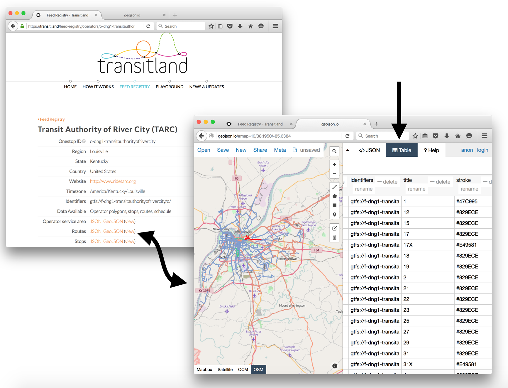
https://transit.land/api/v1/routes.geojson?operatedBy=o-dng1-transitauthorityofrivercityYou can click to download the 2.4 MB GeoJSON file or open in geojson.io (be patient, it will take a few seconds to render).
If you find a feed that you can use to verify your local knowledge, be sure to check the license to make sure it is permissible to add the data to OpenStreetMap. Most importantly, include reference to the agency with the source key.
Interactive Map
Would it be helpful to see where colour is potentially missing from your favorite transit line in OpenStreetMap? There’s a map for that! Hover over any of the bright blue highlighted features to bring up an info bubble with links to editing tools that can be used to add additional tags.
This map is interactive! Open full screen ➹
If you are not familiar with Washington DC, open the full screen map and search for your city! You might even find your favorite route missing all together. Sometimes you will notice a collection of station icons without a route connecting them. Of course, if you see anything missing, you can always shift+click the map to launch the iD editor.
Getting Started with OpenStreetMap
Need instructions on how to edit with iD? Here are some links to outstanding tutorials from LearnOSM, the OpenStreetMap wiki, and the United States Department of State’s Humanitarian Information Unit:
Are you a mapping wiz and interested in a more advanced editor? Try out JOSM with excellent documentation from Mapbox.
Puzzled by the mystery of relations? InaSAFE has a JOSM tutorial featuring relations.
Get outside, increase your local knowledge, and share it with the world through your OpenStreetMap edits!
Check out all the posts in the Targeted Editing series:
