Since we announced our collaboration with the World Bank and more partners to create the Open Traffic platform, we’ve been busy. We’ve shared two technical previews of the OSMLR linear referencing system. In this series of blog posts, we’ve been sharing more about how we’re using Mapzen Map Matching to “snap” GPS-derived locations to OSMLR segments, and how we’re using a data-driven approach to evaluate and improve the algorithms.
Background
So far we have seen that map-matching accuracy can be affected by both variables we can fix over time (e.g. GPS sample rate) and those we cannot (e.g. GPS accuracy/noise). The ability to predetermine a sample rate allows us measure its impact on match error and make recommendations to our data partners regarding the fidelity of their data. Conversely, because GPS positional accuracy is so highly variable, we must make a more nuanced decision about the range of expected noise levels for which we wish to optimize the algorithm.
A third class of variable that impacts map-matching performance consists of those related to the built environment. Like GPS sample rate, built environment characteristics remain fixed in the short term, but like GPS accuracy, we have no control over them. Thus, despite our intuition about the impact of something like road network density on match performance, we cannot recommend that a data provider build a less dense road network. Nevertheless, it is still worthwhile to quantify the relationship between built environment characteristics and map-matching performance for two principal reasons:
- to help set expectations for both our users and data providers based on characteristics specific to their region (i.e. determine the upper limit of performance)
- to make more informed decisions about how conservative we want to be when separating the good data from the bad:

In the analysis that follows, we will rely on road network density as a proxy for the character of the built environment. Road network density reflects a number of highly relevant environmental characteristics including land use types, city block size, and the prevalence of urban canyons.
The analysis will proceed in two parts. First, we will assess the match rates of individual road segments as a function of the local road network density at that segment. Second, having established the relationship between density and map-matching performance on the smallest of scales, we will undertake a case study comparing the regional performance across two cities with very different road network structures. Continue reading below or following along in the accompanying Jupyter Notebook here.
Segment-level Analysis
Mapzen’s Valhalla routing engine measures road network density as as function of the total length of the road network contained within a 2 km circle around a given node on the network. In this way we derive measures of road network density at each individual segment of a network. The densities are normalized across a range of integers from 0 to 15.
To compute density measures, we can use the Mapzen Map Matching service. For more information, see the trace_routes action and the density attribute in the API documentation.
In this analysis, we will sample routes across a variety of different U.S. cities we ensure that our segments will span the entire range of possible densities. Here we have selected 15 cities of varying sizes and geographies:
cities = ['New York City', 'Los Angeles', 'Dallas, TX', 'Miami, FL', 'Levittown, NY', 'Prescott, AZ',
         'Flint, MI', 'Chicago, IL', 'Boulder, CO', 'Lincoln, NE', 'Charleston, SC', 'Portland, ME', 'Akron, OH',
         'Philadelphia, PA', 'Baton Rouge, LA', 'Knoxville, TN']
Generate routes
import validator.validator as val
minRouteLen = 1     # specified in km
maxRouteLen = 5     # specified in km
numRoutes = 50
allRoutes = []
for cityName in cities:
        routeList = val.get_routes_by_length(cityName, minRouteLen, maxRouteLen, numRoutes, apiKey=mapzenKey)
        allRoutes += routeList
Generate scores for all routes
In this disaggregate analysis, we don’t care about what city or route each segment match came from. Instead, we’ll pool all of our segments to determine whether those that were correctly matched have a different distribution of road network densities than those segments that were not.
sampleRates = [1, 5, 10, 20, 30]    # specified in seconds
noiseLevels = [0, 20, 40, 60, 80, 100]   # specified in meters
For now, we’re only interested in density of each individual segment and whether or not it was matched correctly. As such, we’re only interested in the third object in the get_route_metrics() function:
_, _, densityDf = val.get_route_metrics('allCities', allRoutes, sampleRates, noiseLevels, saveResults=False)
The contents of the density dataframe are summarized below:
# random 5 rows of dataframe
densityDf.sample(5)
| density | sample rate | noise | matched | |
|---|---|---|---|---|
| 0 | 13 | 1 | 0 | True |
| 1 | 13 | 1 | 0 | True |
| 2 | 13 | 1 | 0 | True |
| 3 | 13 | 1 | 0 | True |
| 4 | 13 | 1 | 0 | True |
# summary of dataframe
densityDf.describe(include='all')
| density | sample rate | noise | matched | |
|---|---|---|---|---|
| count | 866970.000000 | 866970.000000 | 866970.000000 | 866970 |
| unique | NaN | NaN | NaN | 2 |
| top | NaN | NaN | NaN | True |
| freq | NaN | NaN | NaN | 790219 |
| mean | 10.166303 | 13.200000 | 50.000000 | NaN |
| std | 2.940786 | 10.533761 | 34.156522 | NaN |
| min | 2.000000 | 1.000000 | 0.000000 | NaN |
| 25% | 8.000000 | 5.000000 | 20.000000 | NaN |
| 50% | 10.000000 | 10.000000 | 50.000000 | NaN |
| 75% | 12.000000 | 20.000000 | 80.000000 | NaN |
| max | 15.000000 | 30.000000 | 100.000000 | NaN |
Compare the distribution of road network densities by match type
Kernel density** estimates (KDEs) provide a nice way to estimate and visualize the distribution of a “random” variable. A KDE is estimated, in essence, by applying a rolling average to a frequency distribution or histogram, with the “kernel” loosely defined as the window used to compute that rolling average.
Our hypothesis, derived from the intution that higher densities are more prone to erroneous matches, is that the KDE of road network densities around successfully matched segments should be skewed towards lower values relative to the KDE of densities derived from unmatched segments.
** N.B. - the word density here refers to a probability density, not to be confused with road network density which is the variable we are modeling
The KDE’s for our two distributions are shown here:
val.plot_density_kdes(densityDf)
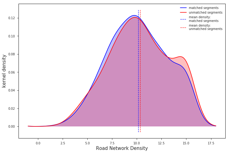
The chart above shows that the distribution of road network densities are actually much more similar than we might expect. It suggests that road network density on its own would not make a good predictor of match rate.
There is, however, a clear difference between the distributions, albeit somewhat small in magnitude. Most importantly, this difference is in the direction that matches our intuition: unmatched segments have a higher mean road network density than their matched counterparts. Given that the distributions were calculated over such a wide swath of sample data – nearly 900,000 individual road segments from 750 routes in 15 different cities – we can be confident that the trend is real.
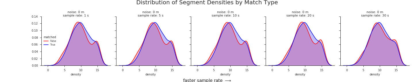
Drilling down a bit deeper, we see that this trend persists across almost all different GPS sample rates and noise levels. It is most pronounced at higher noise levels and slower sample rates:
val.plot_density_kdes_gridded(densityDf, saveFig=True)
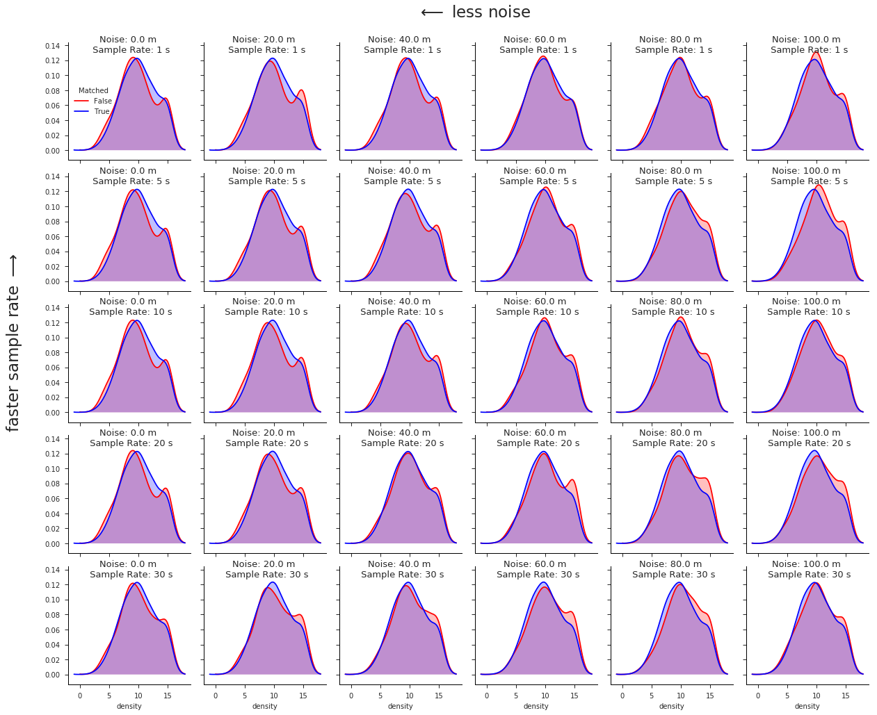 click image to zoom
Another view of the KDE’s in action, iterating through different levels of noise:
Normalize the distributions
Although the evidence so far does suggest a weakly negative influence of road network density on map-matching performance, the actual empirical relationship between the two is somewhat obscured by the KDE’s. Since KDE plots are essentially visualizing a frequency distribution, we may be missing important visual information in the tail ends of the distributions where there simply aren’t as many data points.
Since we don’t really care about the frequency with which different road network densities occur, but rather how these densities impact map-matching performance when they do occur, we can normalize our results by the number of segments we observed at each road network density level (1 - 16).
freqDf = val.normalize_densities(densityDf, sampleRates, noiseLevels)
The first 10 rows from our new dataframe:
freqDf.head(10)
| sample rate | noise | density | matched | frequency | |
|---|---|---|---|---|---|
| segment | |||||
| 0 | 1 | 0 | 6 | False | 0.039440 |
| 1 | 1 | 0 | 6 | True | 0.960560 |
| 2 | 1 | 0 | 7 | False | 0.045342 |
| 3 | 1 | 0 | 7 | True | 0.954658 |
| 4 | 1 | 0 | 8 | False | 0.044005 |
| 5 | 1 | 0 | 8 | True | 0.955995 |
| 6 | 1 | 0 | 9 | False | 0.057152 |
| 7 | 1 | 0 | 9 | True | 0.942848 |
| 8 | 1 | 0 | 10 | False | 0.033078 |
| 9 | 1 | 0 | 10 | True | 0.966922 |
Now that we are dealing with the normalized match frequencies, there is no need to visualize both the matched and unmatched rates – they will always sum to 1. Instead, we will focus our attention on the percentage of unmatched segments at each discrete variable level, since this number more directly relates to the relationship between road network density and match error.
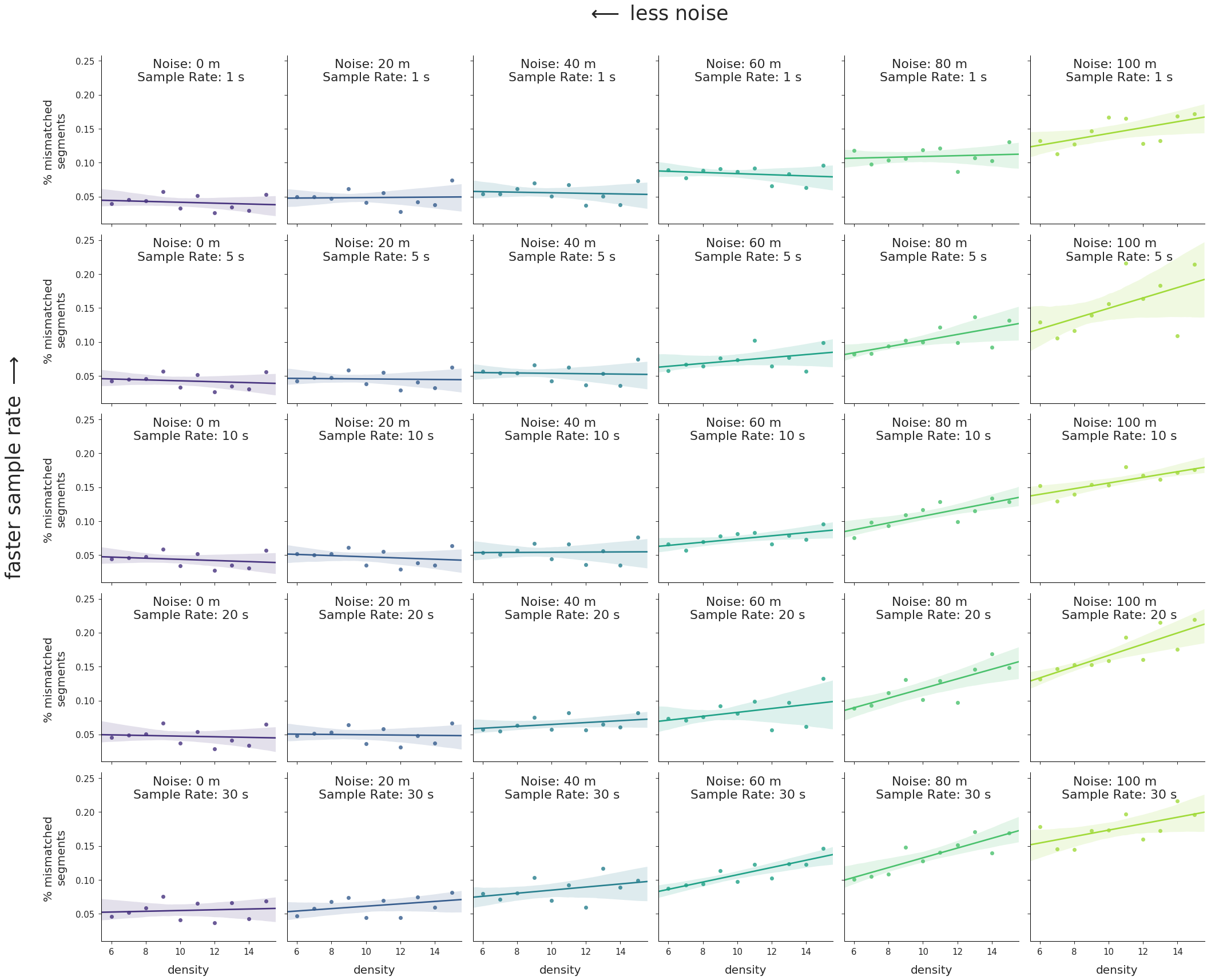
Plotting just the normalized frequencies of segment types where matched == False we arrive at the following:
val.plot_density_regressions(freqDf)
 click image to zoom
And the same charts animated, iterating through noise levels:
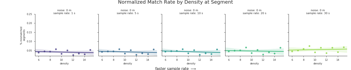
These charts highlight a number of trends that are worth pointing out:
- There is a clear positive correlation between road network density on the
Xaxes and error rate on theYaxes for the majority of noise levels and sample rates. In short, the greater the density of the road network the worse the map-matching results will be. - The strength of this relationship increases with increasing noise, from nearly 0 correlation at the lowest levels of noise to a trendline of nearly 3% error per unit of density at 100 m of GPS noise. In terms of real numbers, a route with an average density of 12 could expect up to 12% greater mismatches than a route traversed in an area with a road network density of ~8.
- Overall error rate increases with GPS noise. This is actually a trend we aren’t interested in, since we’ve already assessed the impact of GPS noise on match accuracy at length. Thus the relative positions of the regression lines along the
Yaxes in the charts only serve as a distraction. In the next section, we’ll fix that problem.
Data standardization
The process of data standardization occurs in two steps:
- Center a dataset about its own mean (i.e. μ = 0)
- Scale the dataset relative to its own standard deviations (i.e. σ = 1)
By standardizing our data across noise levels, we’ll eliminate in this way, we can visualize our data on a single set of axes that highlights just the change in slope between the trendlines at varying levels of GPS noise:
stdDf = val.standardize_densities(densityDf)
The first 5 rows of the standardized dataframe:
| sample rate | density | noise | mismatch rate | stddev mismatch rate | mean mismatch rate | normed mismatch | |
|---|---|---|---|---|---|---|---|
| 0 | 1 | 6 | 0.0 | 0.039440 | 0.010492 | 0.041373 | -0.18 |
| 1 | 1 | 7 | 0.0 | 0.045342 | 0.010492 | 0.041373 | 0.38 |
| 2 | 1 | 8 | 0.0 | 0.044005 | 0.010492 | 0.041373 | 0.25 |
| 3 | 1 | 9 | 0.0 | 0.057152 | 0.010492 | 0.041373 | 1.50 |
| 4 | 1 | 10 | 0.0 | 0.033078 | 0.010492 | 0.041373 | -0.79 |
val.plot_std_densities(stdDf)
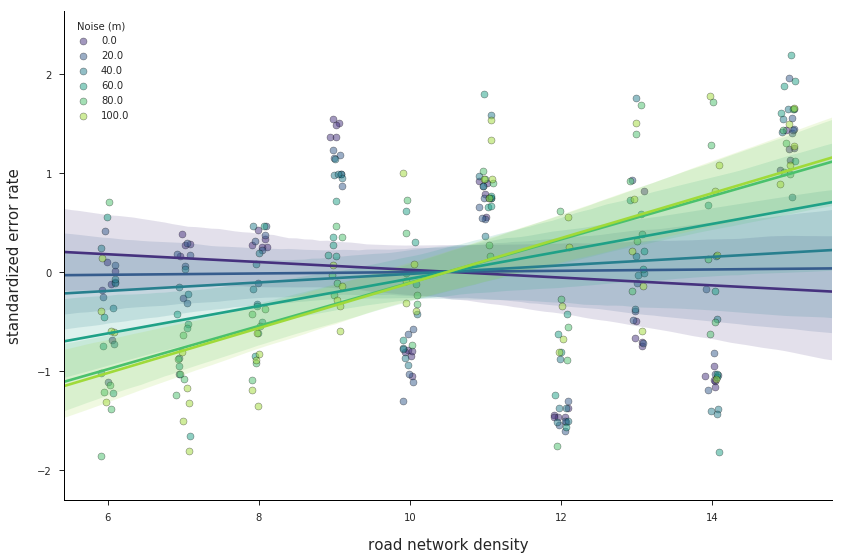
With standardized data, we can more clearly see how road network density exerts an increasingly negative effect on segment match error rate as the level of GPS noise increases. The actual values on the Y axis, however, are unitless, and therefore less easily interpreted.
For some bonus eye candy, we can represent the same data with an interative parallel coordinates plot. This interactive mode of visualization allows us to dynamically filter our data to see how certain variables interact with others. In graph below, drag the magenta line up and down on the road network density axis and watch how the range of standardized error rates change in response:
You can also create new filters by clicking and dragging on the other axes to draw a filter of an arbitrary size. Give it a try!
Regional Analysis: Irvine, CA vs. San Francisco, CA
Clearly the built environment has a significant impact on the likelihood of matching a GPS measurement to its correct road segment. This is a particularly notable finding not just because an end user might expect worse performance in the denser portions of their route, but because two different data providers might expect entirely different performance based on the general character of their service territories. To illustrate this point, we will compare map-matching performance for two cities in California with very different geographies.
|
|
Irvine, California
Irvine is a an affluent, planned city in southern California, just south of Los Angeles. It was planned by the Irvine Company, which continues to control development in the area. Irvine is home to UC Irvine, which is also the city’s largest employer. The city has a population density of 4,057.85/sq mi according to Wikipedia.
cityName = 'Irvine, CA'
routeList = val.get_routes_by_length(cityName, 1, 5, 100, mapzenKey)
noiseLevels = np.linspace(0, 100, 21)
sampleRates = [1, 5, 10, 20, 30]
irvMatchDf, _, _ = val.get_route_metrics(cityName, routeList, sampleRates, noiseLevels, saveResults=False)
San Francisco, California
San Francisco is the second most densely populated major city in the United States, with a density of roughly 17,246.4 people per square mile according to Wikipedia. It is entirely contained within a peninsula roughly 7 miles by 7 miles, and serves as the major west coast hub of American finance and technology.
cityName = 'San Francisco'
routeList = val.get_routes_by_length(cityName, 1, 5, 100, mapzenKey)
noiseLevels = np.linspace(0, 100, 21)
sampleRates = [1, 5, 10, 20, 30]
sfMatchDf, _, _ = val.get_route_metrics(cityName, routeList, sampleRates, noiseLevels, saveResults=False)
Comparison
In the plot below we define “% change” as the difference between the Irvine and SF error rates divided by the Irvine error rate for each simulated sample rate and noise level:
val.plot_regional_comparison(sfMatchDf, irvMatchDf, sampleRates, cityNameA='SF', cityNameB='Irvine')
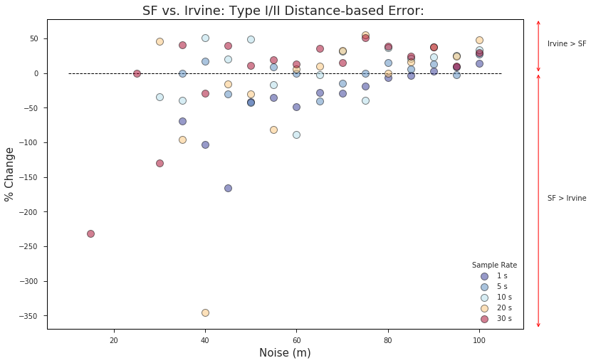
** N.B. - Because the equation can’t be evaluated when the denominator is zero, there aren’t data points for many of the sample rates at the lowest levels of noise where the Irvine error rate == 0.
A few takeaways from the chart above:
- The dominant trend is that as GPS noise levels increase, map-matching performance increases for the less dense region (Irvine) relative to the denser region (San Francisco).
- The difference in density seems to have the biggest impact on slower sample rates. With a 30 s sample frequency, the low-density region outperforms the higher density region with as little as 35 m of noise while the same trend doesn’t occur at the 1 s sample rate until the GPS error is 90 m or more. This suggests that data providers and TNC’s with particularly dense service territories can make up for their structural disadvantages by using faster sample rates.
- San Francisco outperforms the less dense Irvine region at lower noise levels, especially for faster sample rates. This may be due to a number of factors (better OSM data, more one-way roads, better parameter tuning, etc.), but it suggests that there are other differences betweent the two regions apart from road network density that are likely effecting the results shown here.
Conclusions
In this analysis, we’ve tried to examine the extent to which certain built environment characteristics impose structural limitations on map-matching performance. Although it may seem obvious, it is extremely important that data providers and end users alike understand that denser land use types will negatively impact vehicle match accuracies for even the most sophisticated map-matching techniques. Just as important, however, is understanding what we can do about it. Increased GPS sampling rates seems to be one effective approach that data providers have at their disposal for combatting this effect, and surely others exist as well.
Thanks for reading all four posts in this series. To try map-matching yourself, open the Mapzen Mobility Explorer or read Mapzen Map Matching API documentation. To dive deeper into the code behind these map-matching analyses, see this repository on GitHub. And to learn more about Open Traffic and Mapzen’s continued work with GPS probe data, please watch this blog or sign up for our newsletter.
