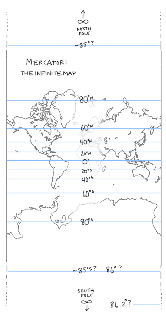
Like most web mapping services, our Tangram library draws maps in the “Web Mercator” projection. This projection has its benefits, but it’s certainly quirky. Mercator projections are well-known for their distortion at high latitudes – this is because they place the north and south poles at positive and negative infinity, which means a Mercator map of the whole world would be infinitely tall.

To save space (and because there aren’t that many points of interest near the poles), all Mercator maps have an arbitrary cutoff point, typically somewhere around 80 degrees. The Web Mercator specifically picks cutoff points so that the whole map makes a perfect square, which has one major benefit: programmers love it.
A square map can be evenly subdivided into increasingly small “tiles”, which are easy to serve, request, and use online. This is particularly useful at high zooms (like zoom 16+), when the distortion isn’t as obvious. And as most web maps are concerned with smallish, non-polar areas, Web Mercator has been the default projection for the web since Google Maps first popularized it in 2005.
Though it is ubiquitous online (and historically useful to navigators), Mercator doesn’t get much love from the modern cartographer. And in general, Mercators are unsuited for cases when you want to compare the size or shape of anything that isn’t near the equator. So while Web Mercator is useful, we’ve been using Tangram to explore other options.
Tangram draws maps in real-time in your web browser, using a hotline to your graphics card called OpenGL. Small programs called “shaders” allow the position and coloring of anything onscreen to be modified instantly, according to your own design.
…Did I say “position”? Why yes, yes I did.
(This map is interactive! Open full screen ➹ )
This is the same vector data as in most of our other demos, but the position of each data point is being modified with a single line of shader code in a Tangram scene file, which looks like this:
position.y += sin(u_time + position.x/EARTH_RADIUS * 2.) * EARTH_RADIUS / 2.;
This is a mathematical function which describes how to move points on a map from one place to another, which also happens to be a very general definition of a map projection.
Most projections are just a series of trig functions which describe how to warp one kind of mapping (generally a sphere) to another (generally a plane). So once you know how to translate those functions to OpenGL, a new Mercator-free world becomes possible using the same method as the wavy map, including everybody’s favorite US-centric equal-area conic projection, the Albers:
(This map is interactive too! Open full screen ➹ )
This version of the Albers adjusts depending on your position on the globe. The math is more complicated than the wavy map, but it’s still well within the capabilities of older smartphones. Try dragging the map around – you’ll see as you navigate that the tiles are still loading as though they were in a standard Web Mercator map, so additional tile-loading code would be needed to fill all the gaps, but it works!
Like most projections, the Albers projects an image of a three-dimensional sphere onto a two-dimensional plane. However, Tangram has another dimension at its disposal:
(All these maps are interactive! Don’t stare at this one too long. Open full screen ➹ )
The above map restores our 2D Web Mercator data to its rightful place in three dimensions, in an actual 3D scene, courtesy of the 3D capabilities of OpenGL – and as Tangram is a Leaflet plugin, you can still pan and zoom this map like any other web map. But why stop there?
From the description of BERG’s Here & There project:
…the ability to be in a city and to see through it is a superpower, and it’s how maps should work.
We tend to agree. As an example, the map below is an homage to the Here & There maps, with a little Inception thrown in:
This bendy map is a mix of two views of the same data: the top part of the map is a standard top-down web map view (plus 3D buildings), and the bottom part is a tilted view of the same scene. A shader then cross-fades between the two views, based on distance from the camera, while you pan around the map.
And this next one rolls those same vector tiles into a tiny planet, by wrapping the tiles into a sphere of constant size and trimming away whatever is left over. Drag it to roll New York up into a beautiful katamari:
Caveat Everybody
Wet-blanket time: these maps are ~highly~ experimental, and not production-ready. The global projections get shaky past zoom 15 because of floating-point precision limits, we don’t have tile-fetching worked out for them yet, and they don’t work with our current labels system – but we’re working to address all of these issues, and as always, we encourage contributions! In the meantime, we think these experiments are useful for demonstrating the ways open data viewed with OpenGL can expand our cartographic horizons.